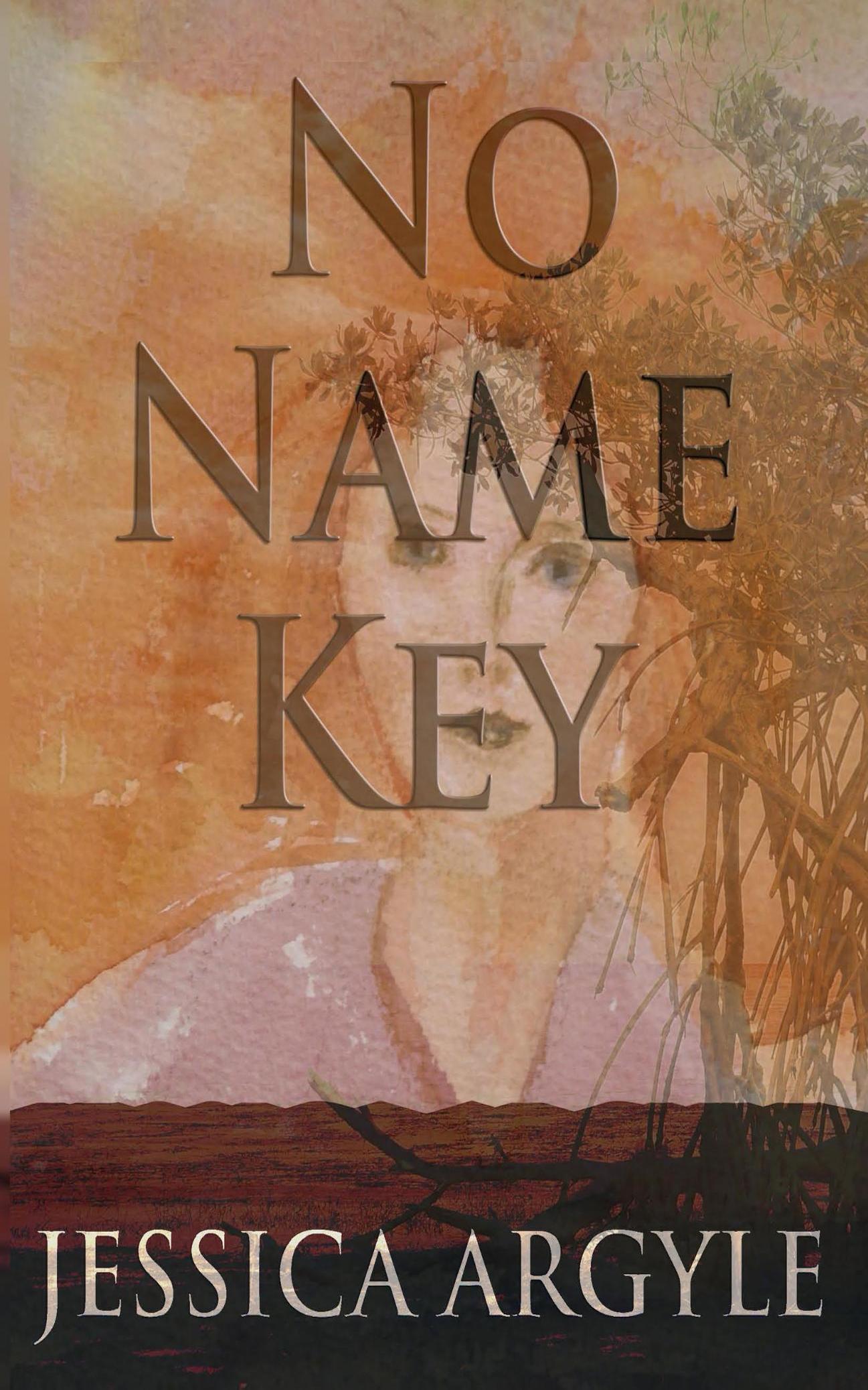
I think my wife, Jessica Argyle, may have had the easy part… writing No Name Key; a great work of historical fiction; a murder story set in No Name Key, in 1935, as the strongest hurricane ever to hit the US came ashore.
 Whether to publish a book yourself, or try to find an agent and publisher was always a question. Amazon has wiped most of the bookstores off the map, and a similar upheaval is happening on the publishing side. Unless you’re Stephen King, and even with a huge following, the economics of being a writer is dismal.
In short, you’re now expected to have your own following, and handle just about all your own promotion in return for a relatively small advance and the cachet of a publisher, then they’ll give you something like 7% royalties; not to mention it could take over a year before your book sees the light of day. The alternative, is to do it yourself… the reward is up to 70% royalties and total control. What do you give up? From what I can see, nothing. If the book is great and a publisher is interested in bringing it to their wider audience, you have all the rights, you can still sign up. And I suspect the terms might be a bit more favorable. Not to mention, with Kindle, immediate worldwide availability.
The downside is having to put the book together for print. I’m not an expert, I’ve done it a couple of times, but each time have to re-learn how to do it – not necessarily a bad thing since the technology is getting better and the exercise is in a lot of ways getting easier. Note that there are a lot of people and companies out there who will be happy to do this work for you; prices, quality, and turnaround vary.
The first decisions are do you want a physical (printed) book, an ebook, or both. We want both, and I’ll cover both in these blog posts. We’ll also assume you’re using Microsoft Word and that your book is well on it’s way to being finished… or at least finished enough to start thinking about publishing.
For physical publishing, it’s Createspace.
For ebook formatting, it’s Calibre. Played with Kindlegen, but Calibre very nicely converted a native Word from docx format and handles all ebook formats, not just the Kindle. The alternative, which I spent hours on, was converting Word -> HTML -> .mobi, which was not bad, but not great.
So the first thing you’ll want to do is choose a size – we chose 5.5″ by 8.5″ and grab a template from CreateSpace, it’s pretty complete. Might as well sign up while you’re there.
Here are a couple of suggestions, all of which were learned the hard way. That’s why they’re written down:
- Once you’re done – run the spell check manually. Twice. Forgot to do this – so used to Word putting little underlines where corrections are needed…
- Consider getting a professional editor; at the least have someone read it very, very carefully. We did this for No Name Key, twice. Once with Harry Dewulf and again more deeply with Laurie Skemp.
- Font: 11 or 12 point, something readable, we chose Book Antiqua. Don’t get cute.
- Start all your chapters on the right hand page… You’ll need to add a blank page at the beginning of your book to get the left/right thing sync’d (odd pages are on the right hand side in most books)
- No headers, footers, or page numbers on pages which start a chapter.. and the text should start roughly halfway down the page. You’ll need to put in a new header/footer for each chapter to do this.
- Ditto, nothing on blank pages (those left-hand pages before a new chapter – empty – really)
- Chapter numbers and text need to line up between chapters. Same with headers. You should be able to flip through pages and see page numbers at the same place.
- Front Matter – the first few pages of the book… was more complicated that I expected – everyone seems to do things a little differently – this is what we settled on:
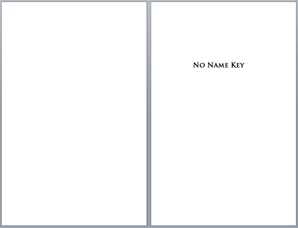
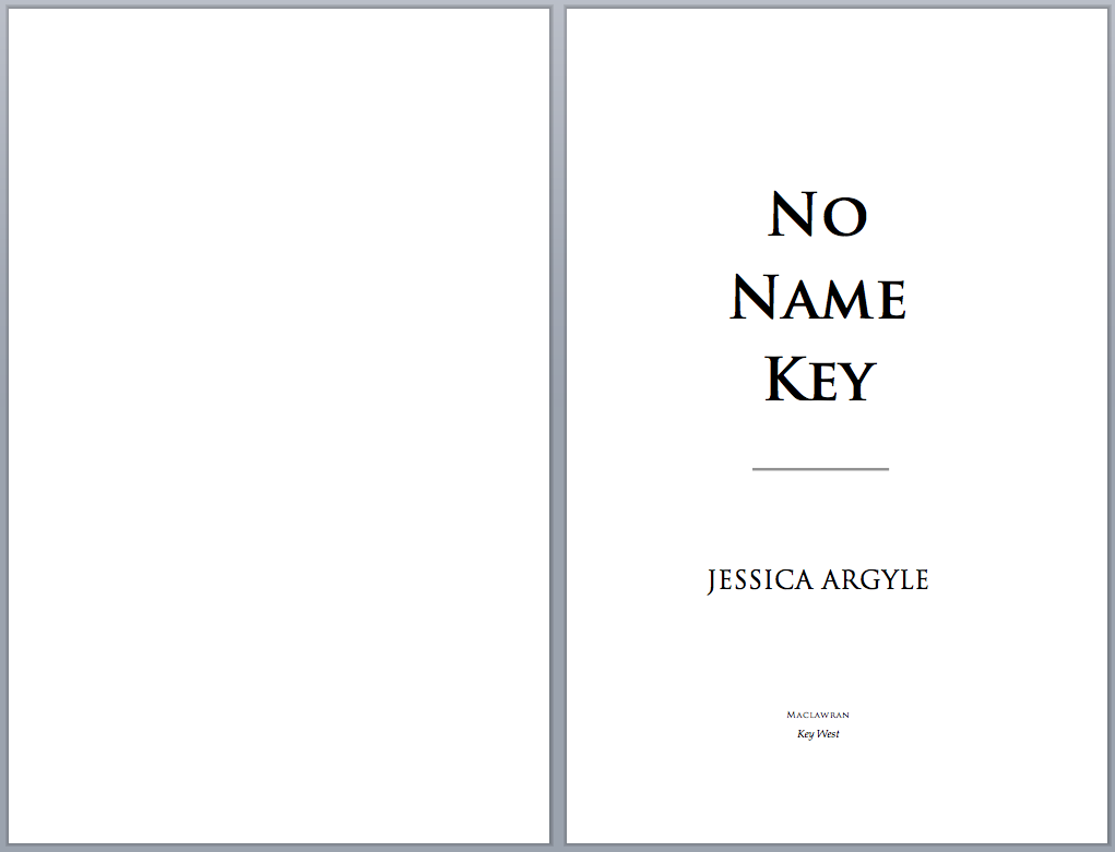
First 4 pages – left hand side is blank – that’s the inside book cover… but you’ll need to add a blank page in there to make things look ‘right’, and the second page has the title only. The author typically signs their books on this page
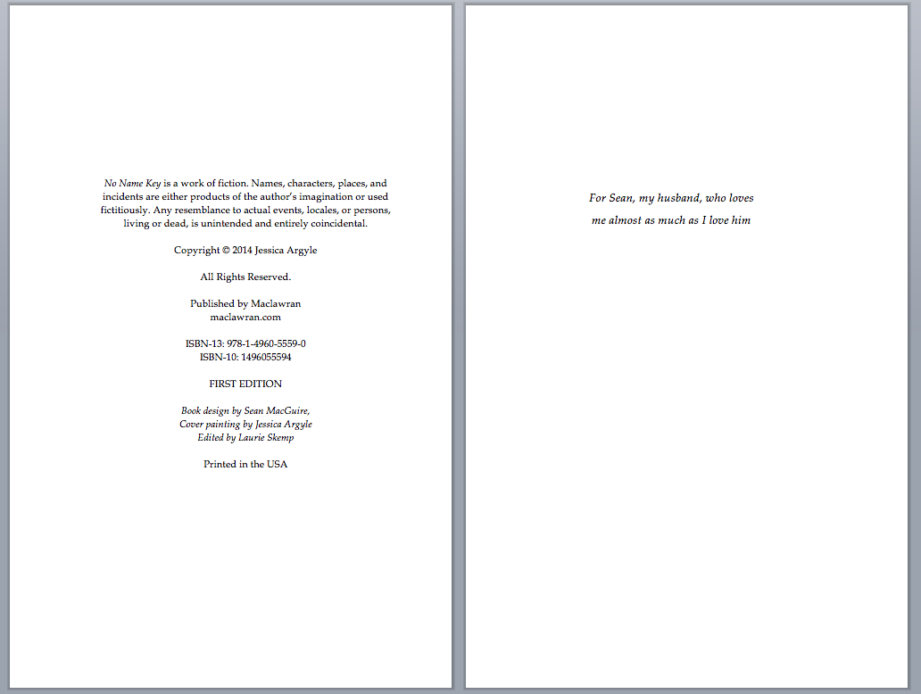
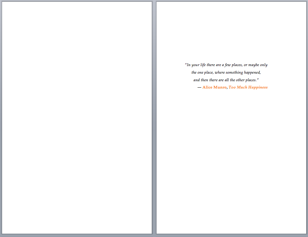
Next 4, a little different. The legal stuff can go on the left hand side. This is copyright information, disclaimers, ISBN numbers, stuff like that. The only interesting thing we did here was to remove all the stupid and scary wording telling people they can’t copy any of the book without our explicit permission. These days you’re lucky if someone opens and reads your book. Don’t be draconian. Encourage sharing. In fact, if you buy the print version, we’ll give you the digital version for free, plus the digital version has no DRM (stupid copy protection). Again we want to make it as easy as possible for people to get, read and share the book. The opposite page is generally the dedication. The book is dedicated to me, as it should be. The following two pages, again a blank left hand side, followed by a quote on the right hand side, note – no headers, footers or page numbers yet.
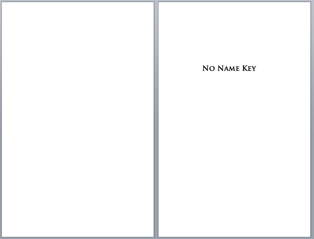
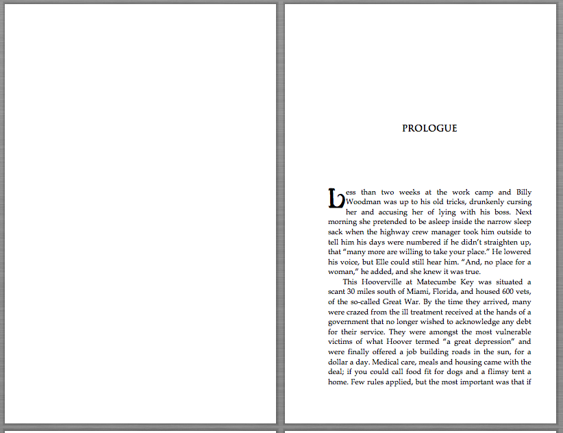
Next set of 4 pages, blank on the left, title (again) on the right. Yes, they do it that way. I don’t know why. But books published by those big publishers do that, and we’re trying to look like we know what we’re doing here. Next set of pages – the story begins… with the prolog. Still no sign of a page number, and again, nothing on the left hand side. Finally, we get full pages of text and can see the headers – page number and author name on the left, book title and page number on the right.

Remember we didn’t want to look self published…. so we need a little embellishment – because everyone knows that people who self publish never 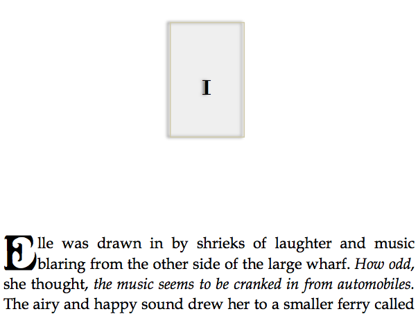 do these sorts of things to make their books pretty. The first thing was the chapter numbers – that’s a font called Didot, 24 point, surrounded by a text box done in Microsoft Word. The shading was done just by reducing the transparency a touch.
The next interesting element is the “Drop Cap” – Most books try to differentiate the start of a chapter by doing something – maybe having the first letter a little bigger, or bold, or in small caps… we went for the “drop cap”… We used the Caribbean Caps font, 31 point. After all, we’re set in No Name Key… so it doesn’t hurt to look a little piratey. The Drop Cap function is Word is easy – mark the letter, Format->Drop Cap and we dropped down 2 lines… and now we have a really nice effect.
So continue like that for the rest of the book.
At the end of the book, there are 2 more sections. The Acknowledgements and About the Author, preferably with a nice picture of yourself. Each of these sections go on their own page – right hand side, again, with the titles aligned with the chapter numbers.
Run a spell and grammar check. Over and over.
Finally, print this file to a PDF, and you’re ready to begin the physical process of printing.
Understand that if you’re going to publish an e-book, and you really should, it’s not going to be identical to the print version. Here are some of the differences:
- No left or right hand side, so no extra blank pages required.
- No ‘real’ page numbering, so no headers or footers required.
- Cover on Kindle has a ratio of 1:1.6, i.e. your cover should be something like 1000×1600. A physical book needs a physical cover of the correct size.
- No back cover or spine to deal with.
- Limited selection of fonts available, depending on the reader.
- No Drop Caps or nice Chapter art (without an impossible amount of pain).
- Do not use a PDF as the ebook source document. Chances are it won’t end well. Really.
Once you’ve formatted the physical book, I would suggest going through the ebook publishing process first. It pretty rigorous and by its very nature, you can correct and republish digital content pretty well instantly, whereas with print it’s “too late”. I learned this lesson the hard way.
Good post, Sean. Don’t forget the all-important gutter margins for the print version and NOT the ebook version.
Sean, this was a great posting! I just received Jessica’s book in the mail and can’t wait to read it. I wanted it, of course, since the first six months of my retirement in 2003 were spent on No Name with John and Lenore Lohr, but what a wonderful surprise when I realized today that it’s a historical novel, as well, and about one of the most tragic and fascinating times during the history of the Keys. I can’t wait to start reading it. I like the format and also the off-white paper it was printed on and hope that is standard for CreateSpace. Thanks again for the informative post! Peggy