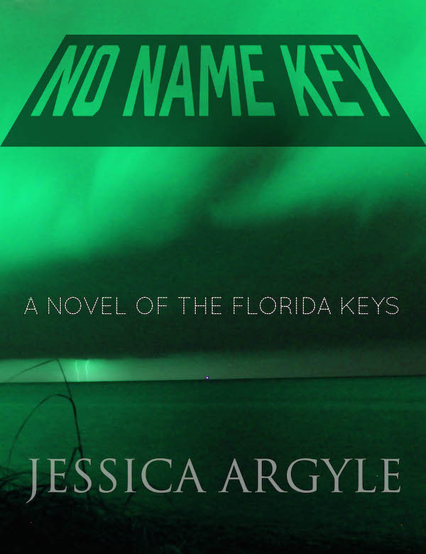
Don’t do the cover yourself! Get a Professional! Mike Dennis, one of Jessica’s writing-group cohorts, spent at least a half hour trying to discourage me from doing the cover. I think he’s got a point. The cover turned out to be a lot trickier than I thought it would be. I’d never really thought about the cover of a book. But if you give it a little thought, it’s the first thing that screams “Self Published”. So off to Google. Lots to look at there. A couple of take aways:
- The cover is rarely a literal interpretation of the book content, rather it should provide a feel for what the book is about.
- Color is important. Warm is better than cold. Looking at the bestsellers page on Amazon was helpful.
- Again, Amazon rules the world. See those book covers? They’re not book covers, they’re itty bitty thumbnails of book covers. That means your cover needs to be legible as a thumbnail. Neither simple, nor obvious that one.
- Oh crap. There’s a back too. And a spine. My head hurts now.
Where to begin? Back to Createspace for a template. Now off to Photoshop. If you’re not happy or comfortable using Photoshop, now is not the time to try. Pay someone, or use one of the online book cover generators. But before you do, try, at least, to have a bit of an idea of what you’d like the cover to look like. In our case, for No Name Key we’ve got a few elements that lend themselves to the cover: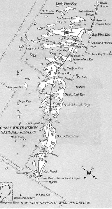
- It’s in No Name Key, a sometimes spooky, somewhat deserted part of the Florida Keys.
- There’s a really bad hurricane coming.
- The woman has red hair.
- There’s a murder.
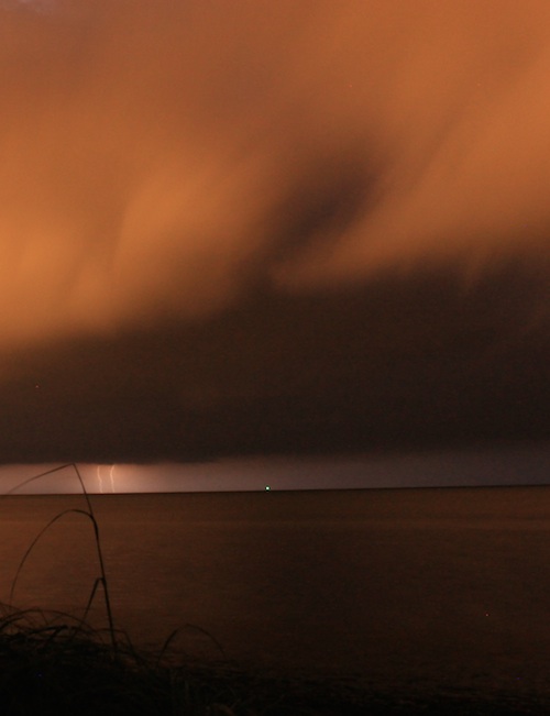
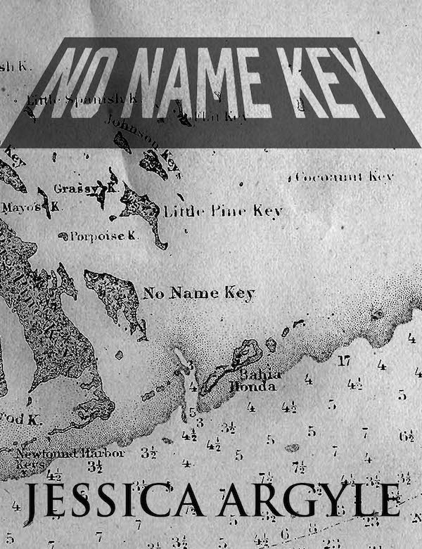
So I started playing around with some photos I’d taken, a storm, a colorized pic of No Name Key… Remember, you want to have the rights to use any pictures you choose can’t just grab stuff off the net, so be a little careful here. But an old map of No Name Key was probably fair game.
That’s when I made a mockup of a couple of versions and cut and pasted over Amazon’s book pages. To see how it might look in real life. Click on the picture below to see a larger version, and look for No Name Key amongst the competition. 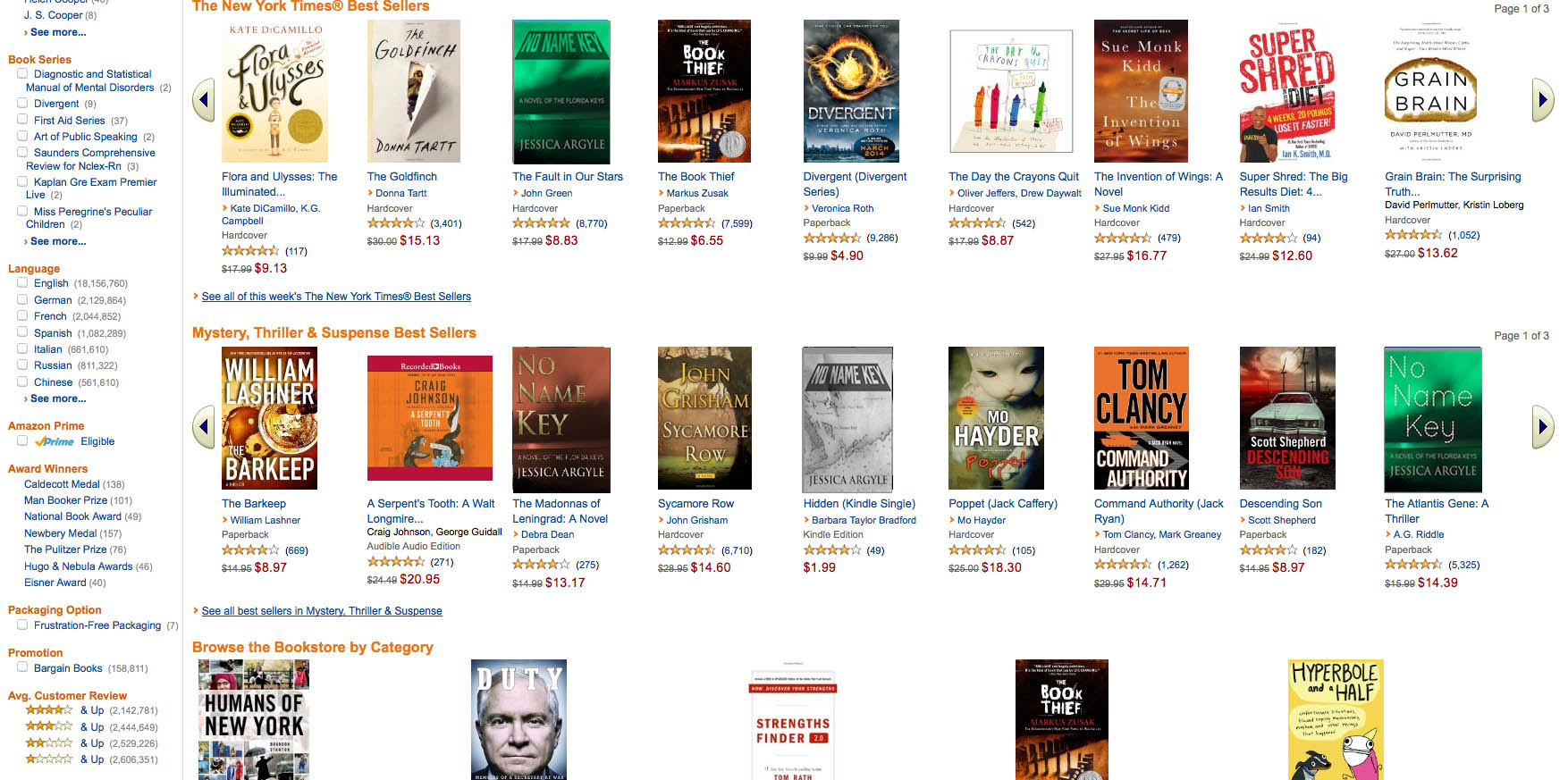 The big questions were:
- Can I read the title and author when the cover is that small?
- Does the book stand out from everything else, or at least not look like crap next to these other books?
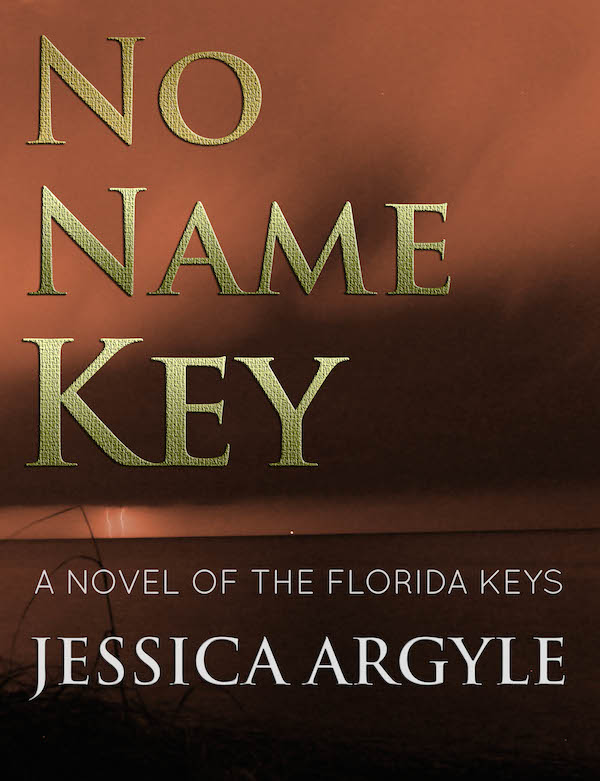
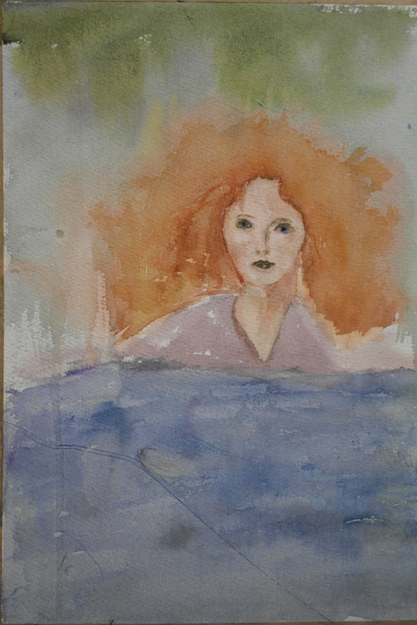
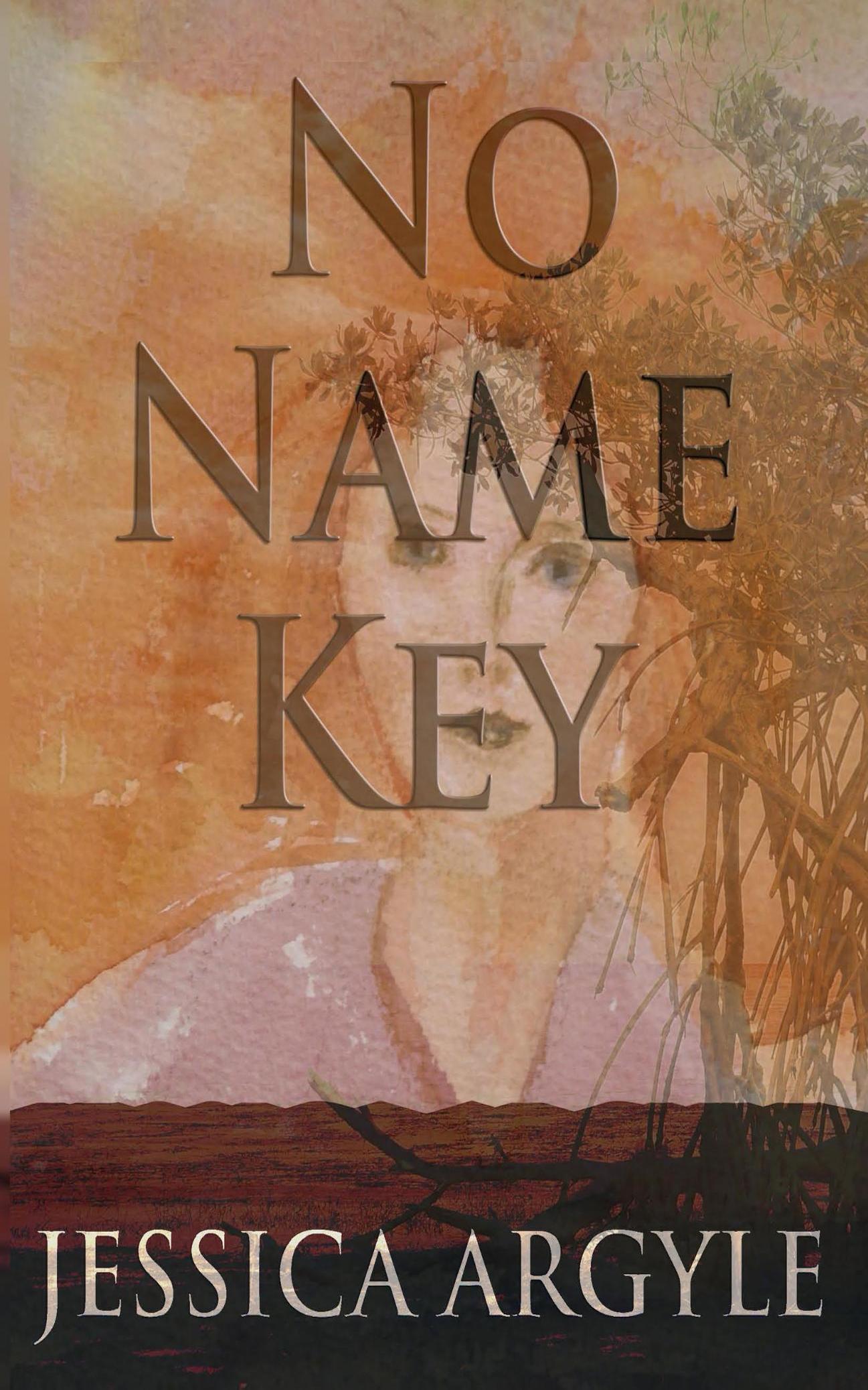
By now, things had gone a little orange, and the bigger font looked better. But I still liked that old map. Then Jessica came to the rescue. Good thing seeing that it’s her book. She’s a painter, and had this painting lying around. That painting did a pretty good job evoking the main character, Elle. That plus the photo of No Name Key in the background, lightened up a bit, but translucent lettering, and I think we’ve got it…
The back? And spine… What goes on the back of the book? Go look at some books and see,
Usually there are a few things:
- Some blurbs from a known author about your great book
- A summary of what’s in the book
- A bar code for payment scans
- Some sort of background
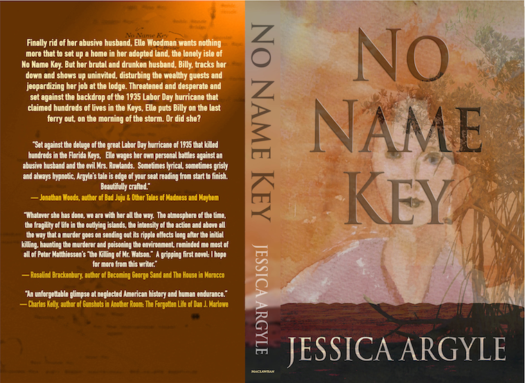 Immediately we’re presented with a problem. You’re supposed to have a blurb about the book, but the book’s not out. Not only is the book not out but you’ve got to find credible people to read it, and agree to give you a blurb. More than a little daunting. Get those blurbs.
Plus the back of the book needs to fit with the front of the book… here’s what we came up with.
Look carefully, you’ll see that old map, colorized as the background, and we made up a nice description to go with the blurbs. The extra space at the bottom is to leave room for the barcode.
Once that’s done, it’s time to login to CreateSpace and upload your interior PDF and your book cover. They’ll get back to you in 24 hours with any issues. Sometimes they don’t explain issues very well, I didn’t realize that CreateSpace adds the barcode; I’d added my own, but they didn’t say – “Hey You – Lose the Barcode”. They just said the formatting was wrong… that cost a couple of days.
Once you make it through their process you can order a few proof copies – we ordered 5 – just to make sure everything looks great before printing. We ended up making some minor changes to the title – lowering the lettering, and lightening up the back a bit.
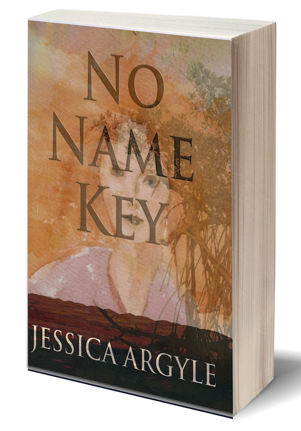
A last thing was to have an image of book itself. I cheated… took this and slapped the cover on it… ended up with this… like magic.
